Your Cart (0)
Your cart is empty
Free express shipping

Drawer menu
Free express shipping

TL;DR:
- The right stone texture can make a room feel warmer and more luxurious by creating depth and character through contrast. Lighting plays a crucial role in revealing and enhancing texture, requiring thoughtful placement to maximize visual impact. A curated, restrained approach to layering textures ensures sophistication, avoiding overwhelming or flattening the space.
Stone has a reputation for being cold and hard. But the designers who work with it most closely know a different truth: the right stone texture can make a room feel warmer, more grounded, and unmistakably luxurious. Texture is the silent variable in stone design, the element that determines whether a surface feels alive or merely expensive. This guide breaks down how texture shapes mood and spatial depth, how light reveals it, how to layer it intelligently, and how to avoid the mistakes that even experienced designers make when working with natural stone.
| Point | Details |
|---|---|
| Texture shapes atmosphere | Thoughtful stone textures add depth, interest, and a sense of luxury to interior spaces. |
| Lighting reveals detail | Strategic lighting, especially grazed or angled, unlocks the full visual potential of stone texture. |
| Mix with intention | Balance contrasting textures and layer materials carefully to avoid visual overload or monotony. |
| Restraint is luxury | Editorial use of texture signals craftsmanship—it’s not about quantity, but about curation and focus. |
| Test before committing | Mock up texture and lighting combinations in your space to ensure the best final effect. |
Stone surfaces are not just backgrounds. They are active participants in how a room feels. A large expanse of flat, polished marble has its place, but without textural contrast, it can read as cold or sterile. Introduce a rough-hewn travertine wall beside it, and suddenly the space has hierarchy, tension, and soul.
Texture breaks up visual monotony in a way that color alone cannot. When light hits a brushed or honed surface differently than it hits a polished one, the eye recognizes dimension. The brain reads that dimension as richness. This is why rooms with intentional textural contrast feel more layered and thought-through than rooms relying purely on material quality.
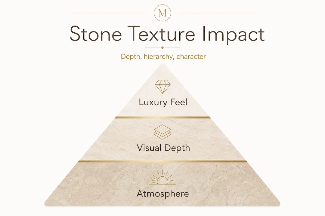
Texture-through-contrast creates depth, hierarchy, and focal points in luxury interiors by mixing rough-hewn surfaces with smooth, polished ones. That dynamic is not about randomness. It is about leading the eye from one surface to another, creating a visual journey through the space.
Consider stone’s impact on interiors more broadly: the material carries weight, permanence, and natural variation. Texture amplifies all three qualities. It communicates that what you are looking at is genuinely natural, not a printed tile or a composite panel.
| Texture type | Typical surface feel | Visual effect | Best application |
|---|---|---|---|
| Polished | Glassy, mirror-like | Reflective, formal, expansive | Floors, feature walls, countertops |
| Honed | Matte, smooth | Soft, understated, modern | Bathrooms, tabletops, wall cladding |
| Brushed/leathered | Slightly raised grain | Warm, organic, tactile | Accent walls, bar tops, side tables |
| Split-face/rough-hewn | Deeply irregular | Rustic, dramatic, grounding | Feature walls, fireplace surrounds |
| Tumbled | Worn, rounded edges | Aged, casual, approachable | Flooring, garden spaces, casual interiors |
“Texture in stone is not a finish option. It is a design decision with spatial consequences. Choose it the way you choose proportion, not as an afterthought.” — Marmorique design perspective
The table above shows that each texture category sends a different emotional signal. Polished marble says formal elegance. A leathered travertine accent says warmth and craftsmanship. Knowing the emotional vocabulary of each texture type gives you real control over how a room communicates.
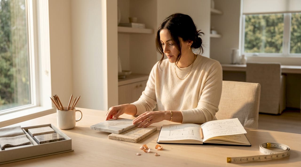
Surface finish is critical, but texture only fully comes to life when lighting works with it. This is one of the most underestimated relationships in interior design. You can source the most beautiful split-face stone in the world and have it completely disappear under flat, overhead fluorescent lighting.
The principle at work is called grazing light, which means light positioned at a low angle to the surface so that it rakes across the relief and creates shadow in the recesses. Those shadows are what the eye reads as texture. Without them, even a deeply carved stone surface can look flat.
Lighting methodology is the key mechanism for making stone texture read as real and three-dimensional. This applies whether you are working with wall sconces positioned along a stone corridor or floor-level uplights washing a travertine feature wall.
| Lighting angle | Effect on stone texture | Works best with |
|---|---|---|
| Grazing (low, angled) | Maximizes shadow depth, reveals full relief | Rough-hewn, split-face, brushed surfaces |
| Directional (45 degrees) | Balanced contrast, shows texture without harshness | Honed, leathered, tumbled finishes |
| Diffuse/overhead | Flattens relief, reduces perceived texture | Polished surfaces where reflection is the goal |
| Backlighting | Creates silhouette and translucency | Thin marble slabs, onyx panels |
Natural light follows a similar logic. A stone wall facing a large east-facing window will be more textural in the morning, when light enters at a low angle, than at midday when the sun is overhead and diffuse. This is not a problem to be solved; it is a quality to be celebrated and planned around.
Pro Tip: Before you finalize fixture placement in any stone-heavy room, visit the space at different times of day. Note when natural light falls at low angles and position your artificial lighting to supplement that effect during evening hours. You are essentially choreographing texture across a 24-hour cycle.
Great stone decor lighting tips consistently emphasize one principle: treat light as a material in its own right. It does not just reveal stone; it completes it.
Understanding how light amplifies relief brings you to the next design challenge: how to compose multiple textural elements without tipping into visual chaos. This is where the real craft of luxury interior design shows itself.
The strongest rooms layer stone with other materials, specifically wood, metal, and glass, to create what designers call tactile complexity. A marble side table next to a brushed oak console next to a steel-framed window creates a conversation between surfaces. Each material reflects and absorbs light differently. Each asks the eye to engage in a different way.
Stone texture alongside other materials creates a layered, grounded atmosphere and engages light on multiple surfaces simultaneously. When Vincenzo De Cotiis creates an interior environment, the layered material approach is always the architecture of his composition, not the decoration on top of it.
Here is a stepwise framework for curating textural stone in any interior:
Pro Tip: Use texture to draw the eye toward architectural features you want to celebrate, not toward ones you want to minimize. A richly textured stone surround on a fireplace commands attention in a way that plain drywall simply cannot, and it earns that attention.
There are also some principles worth keeping as guardrails:
Even with the best materials and intentions, textural stone design goes wrong in predictable ways. Recognizing these pitfalls before you commit to installation is far cheaper than correcting them afterward.
Pro Tip: Before committing to a full installation, set up a temporary mock-up in a small zone of the actual room using large stone samples. Photograph the mock-up under the room’s natural and artificial lighting at different times of day. The camera reveals flattening and contrast issues that your eye can miss when you are standing close to the material.
Here is an uncomfortable truth about luxury and texture: most of the rooms that try hardest to impress with stone texture are not the ones that actually succeed. The tendency to pile on contrast and relief and drama is understandable, but it is fundamentally at odds with what high-end stone design actually communicates.
Some interior design guidance frames texture as a near-universal beauty mechanism, suggesting that more texture automatically means more interest and more richness. The luxury-material approach implies the opposite: texture should be curated with the same discipline applied to furniture selection or art placement.
Think about the most quietly extraordinary interiors you have seen. They almost always have a single material or surface that stops you in your tracks. One perfect stone element, lit exactly right, in relationship with carefully chosen surrounding materials. That singular focus is not scarcity; it is confidence.
The luxury material approach teaches a consistent lesson: edit ruthlessly and commit fully to what remains. A single wall of dramatically textured travertine, surrounded by smooth plaster and warm-toned wood, is infinitely more powerful than four walls of competing stone finishes.
Think like a curator, not a collector. A curator asks what this piece adds to the whole and whether it strengthens or dilutes the story. A collector asks only whether the individual piece is beautiful. Both impulses are valid in their own context, but only the curatorial mindset produces rooms that feel genuinely refined rather than expensive.
Restraint in stone texture is not about playing it safe. It is about earning every decision. When you use a rough split-face stone accent wall in a room where everything else is quiet and considered, that wall commands the space with authority. Use it in three places and it loses that power entirely.
Ready to move from concept to selection? The principles in this guide are most useful when you have access to materials that are worthy of the decisions you are making.
At Marmorique, we curate natural marble and travertine decor objects, from lamps and tables to bathroom accessories, specifically for interiors where texture and craftsmanship matter. Every piece is selected for its material integrity and its ability to anchor or accent a space with genuine presence. For personalized guidance on pairing textures and finishes for your specific project, our expert stone decor advice resources are a strong starting point. Browse the collection and find the texture that speaks to your design story.
Contrasting polished and rough textures such as marble paired with split-face travertine are consistently popular for their visual drama and tactile richness in high-end residential and commercial spaces.
Grazing or angled light enhances relief and casts shadow into recesses, making stone textures far more pronounced and three-dimensional than flat, diffuse overhead lighting ever can.
Yes, overusing intense textures creates visual noise and makes rooms feel restless rather than refined; texture as a design mechanism works best when it is curated with restraint and clear hierarchy.
Neglecting to evaluate a room’s lighting conditions is the most frequent error, since diffuse or overhead lighting flattens even high-quality textured stone and significantly reduces its visual impact.
Set up a small-scale mock-up using large stone samples in the actual room, photograph it under all available lighting conditions, and evaluate the results before ordering full-scale installation quantities.


